My Mac Pro Wish List
Apple did something actually courageous last month when they invited five journalists to their headquarters in Cupertino and revealed the company's future plans regarding the long neglected Mac Pro. To any long-time Apple watcher, this was dramatically out of character of the company to reveal any future plans regarding a specific product and to openly discuss how a current product failed to meet customer needs. While they were a slightly coy in their apology, any apology at all is a huge admission on their part.
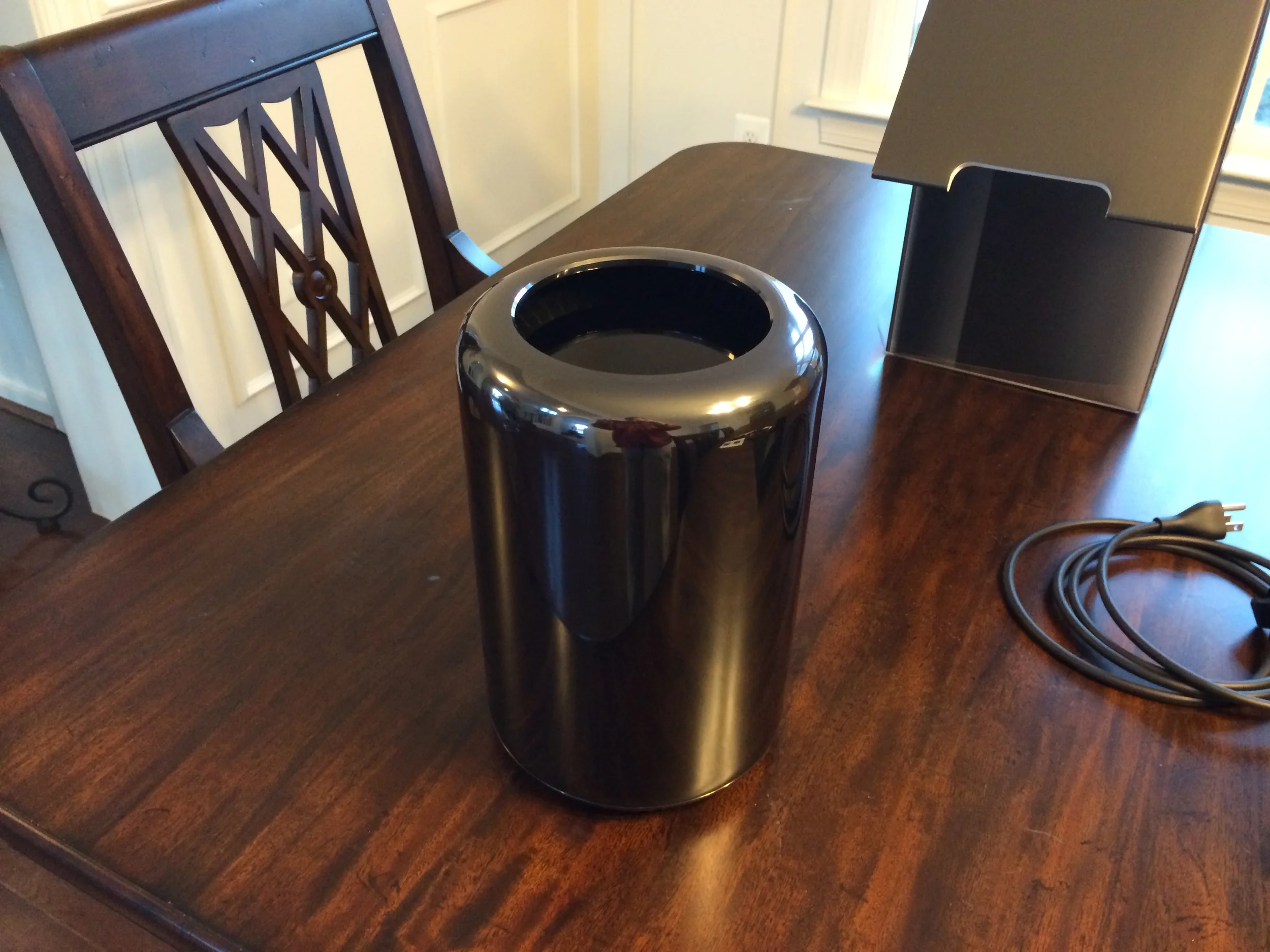
Much has already been written about this and by better writers than I, so I'll leave you to go read all about it. However, I am one of the professionals that so many bloggers and podcasters have been talking about who use and a Mac Pro. I own a 6-core version of the 'trashcan' Mac Pro I bought when Apple released it in late-2013, but didn't receive mine until late-March of 2014 despite having ordered it on New Years eve in 2013. Yes, they took that long to ship out to customers.
In my opinion, the current Mac Pro design is irresponsible. "Whoah, wait just a minute Joel, those are harsh words"! you may be saying. Yes, they are. Let me explain.
Iressponsible
I want to say it again: the trashcan design was irresponsible. That may seem like an odd word to use to criticize the product with but the design pushed the responsibility of expanability onto the user and out of the hands of Apple's design team. Rather than make tough choices of how large to make the case to accomodate storage drives, or expansion cards, or the many options a 'cheese grater' Mac Pro offered its users, Apple's designers essentially said, "Trying to solve this problem is too hard. We want to make a symmetrical, beautiful design that looks nice sitting on a lightly stained maple table in one of our many stores around the world. Lets just take the easy way out and make a pretty, compact shape and lazily stick a bunch of ports on the back and push the responsibility of delivering a working, useful professional workstation back onto the customer."
What is the result of this design decision?
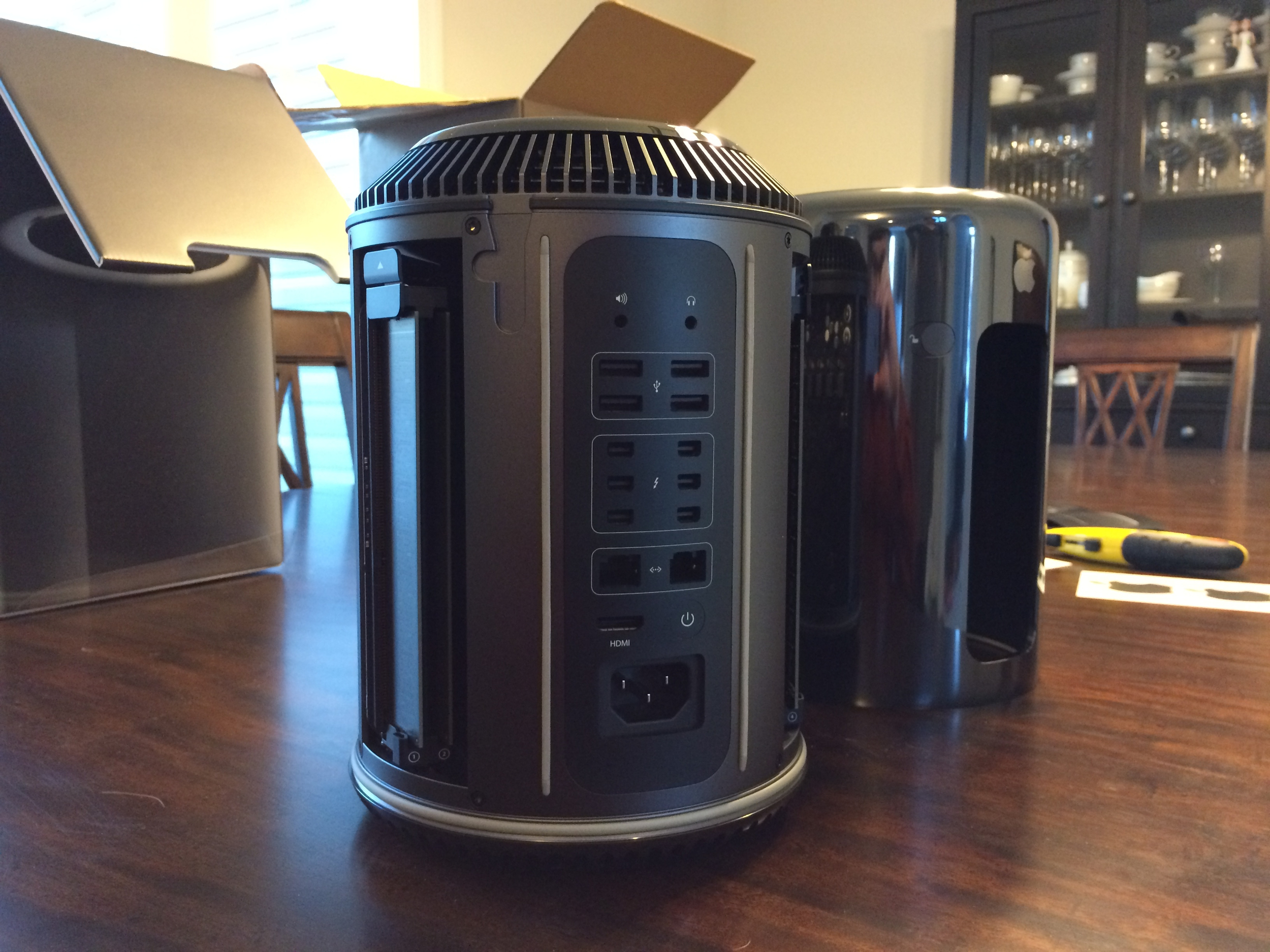
This photo:
Pardon the dust.
In the photo above, my Mac Pro is connected to the following:
- Ethernet -> Wall Outlet (Internet & my home network [gigabit])
- USB -> Lightning -> iPhone
- USB -> Lightning -> iPad
- USB -> KVM Switch
- USB -> External Storage Drive 1
- Thunderbolt -> Thunderbolt Dock (for more Thunderbolt & USB ports)
- Thunderbolt -> Displayport Monitor
- Thunderbolt -> External Storage Drive 2
- Thunderbolt -> External Storage Drive 3
- Thunderbolt -> KVM Switch
- Thunderbolt -> (my only open port)
- HDMI -> unused
- 3.5mm Line In -> spare audio cable for old headphones I sometimes use.
So yes, while the 2013 Mac Pro was a beautiful visual design, in practice, the design falls flat on its face...hard. I would wager that almost no customers who bought one of these machines, don't also have a similar cable situation going on behind it.
Now, I can see how the old cheese grater design might have also had a few cables coming out of the back of the case....but the case design was meant to sit under a desk where those cables could be made to be out of sight. The 2013 Mac Pro design was meant to be put on your desk, as if on display. And while this may work great on a lightly stained maple table in an Apple Store, this ends up being horrible in customers' homes.
So What Do I Want Instead?
- A big, rectangular, aluminum case
Just give me something I can put under my desk, and allows you to refresh every 6-12 months with new processors, graphics cards, RAM, and SSDs on your store. Something that I can have cables coming out of, under my desk, tucked away out of sight.
- Minimum of four INTERNAL SSD slots
Hell, you can even go crazy and give me six. I wont complain. If I can buy SSDs off Amazon and plug them in via PCI-E or even SATA - I'm fine with that. The alternative is losing half my desk space to external storage enclosures and cables going everywhere - which is what I have now and I hate it.
- An NVIDIA modern, gaming graphics card.
And I don't even want to play games on it. Gaming cards are what drives the industry. They're the best cards. New versions of them are released constantly. Just give us an internal PCI-E accelerated slot, like modern cards require and whatever the latest 1080 card NVIDIA is making right now. And 12 months from now, we can swap it out for a new card if we need be. If you're too slow to update your Mac Pro lineup, you wont hear us complaining constantly because we solved the issue ourselves freeing you up to continue squeezing every ounce of functionality and practicality out of the rest of your product line sacrificed on the altar of thiness in Jony Ive's white world.


